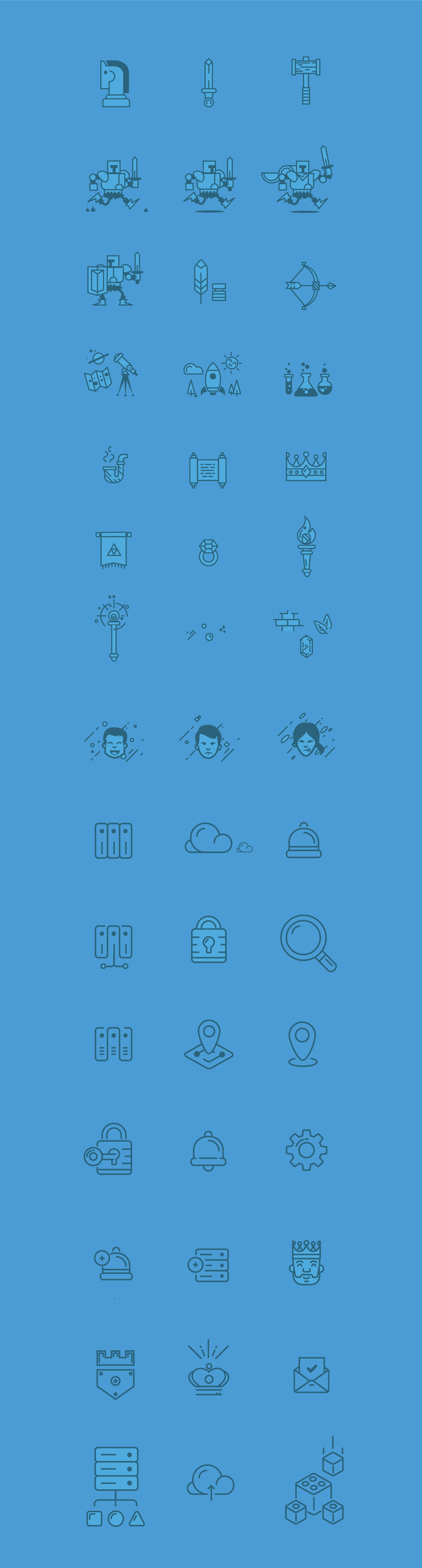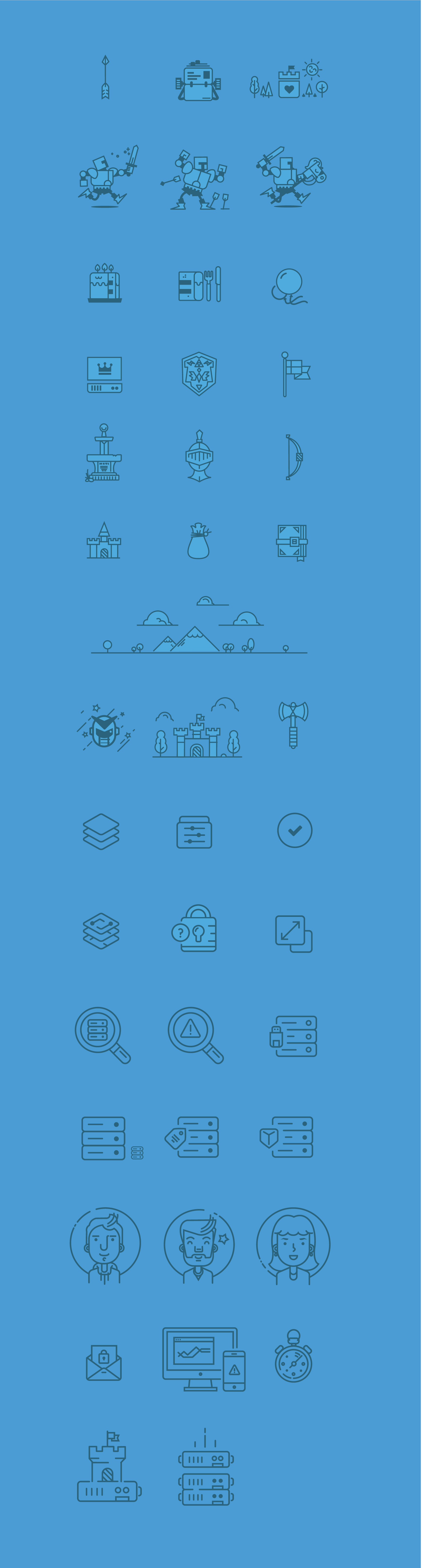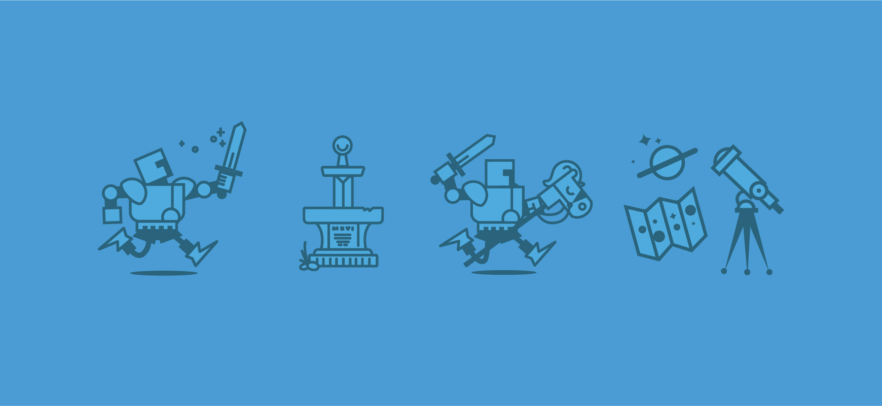
Each feature and project that we took on as a design team followed a Castle visual style. We wanted the Castle look and feel to stand out in a crowd of companies that had a very corporate and cookie cutter look and feel. We wanted to create a set of illustrations that would help establish a Castle voice that was easily recognizable.
I was the Lead UX Designer at Castle and worked with another UX Designer. I was an integral part of creating our visual design since the other UX Designer was weighted more heavily on the research side of design.
The challenge with our illustrations was that we needed to balance fun with a subject matter that was very technical. Concepts such as failover, redundancy, storage profiles, throughput etc. were complicated concepts to visualize and make easily recognizable.