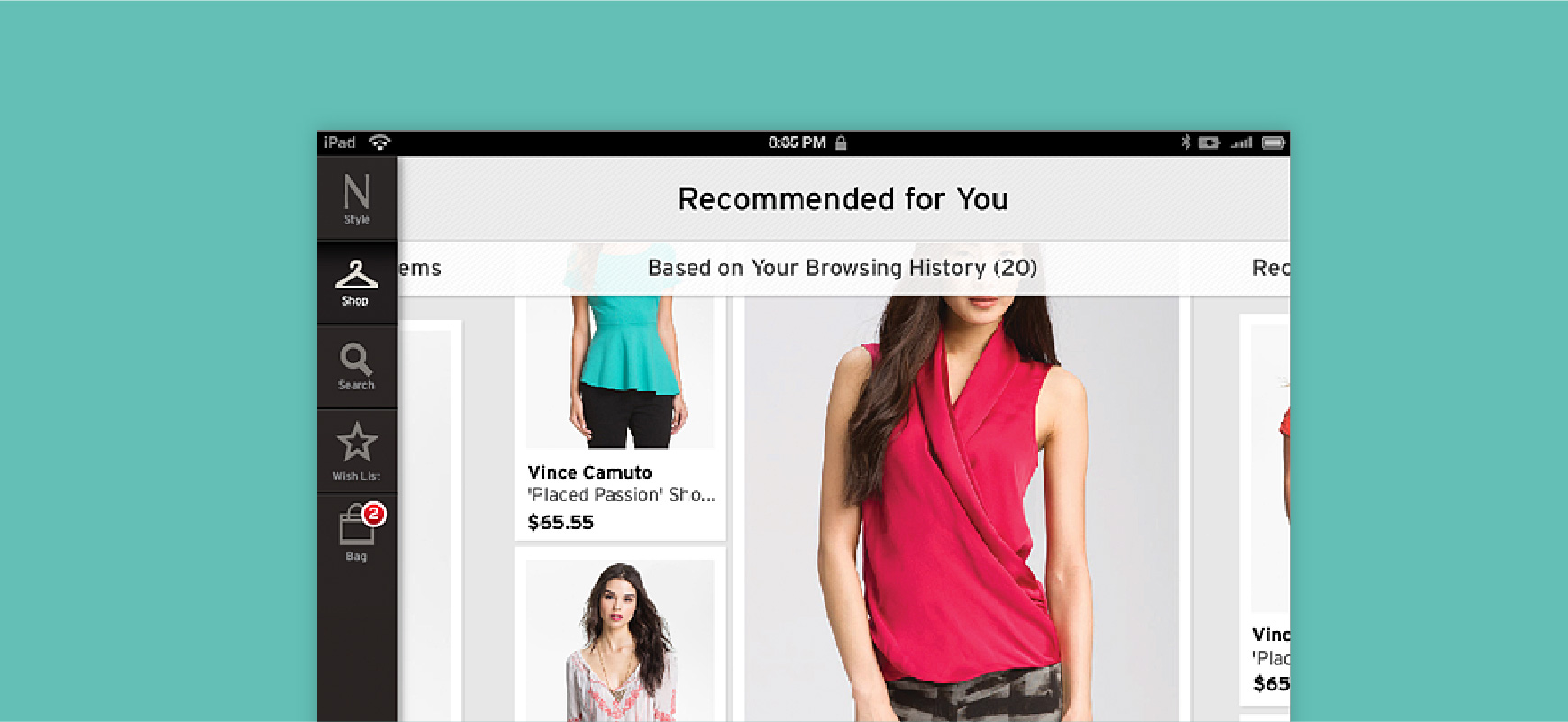
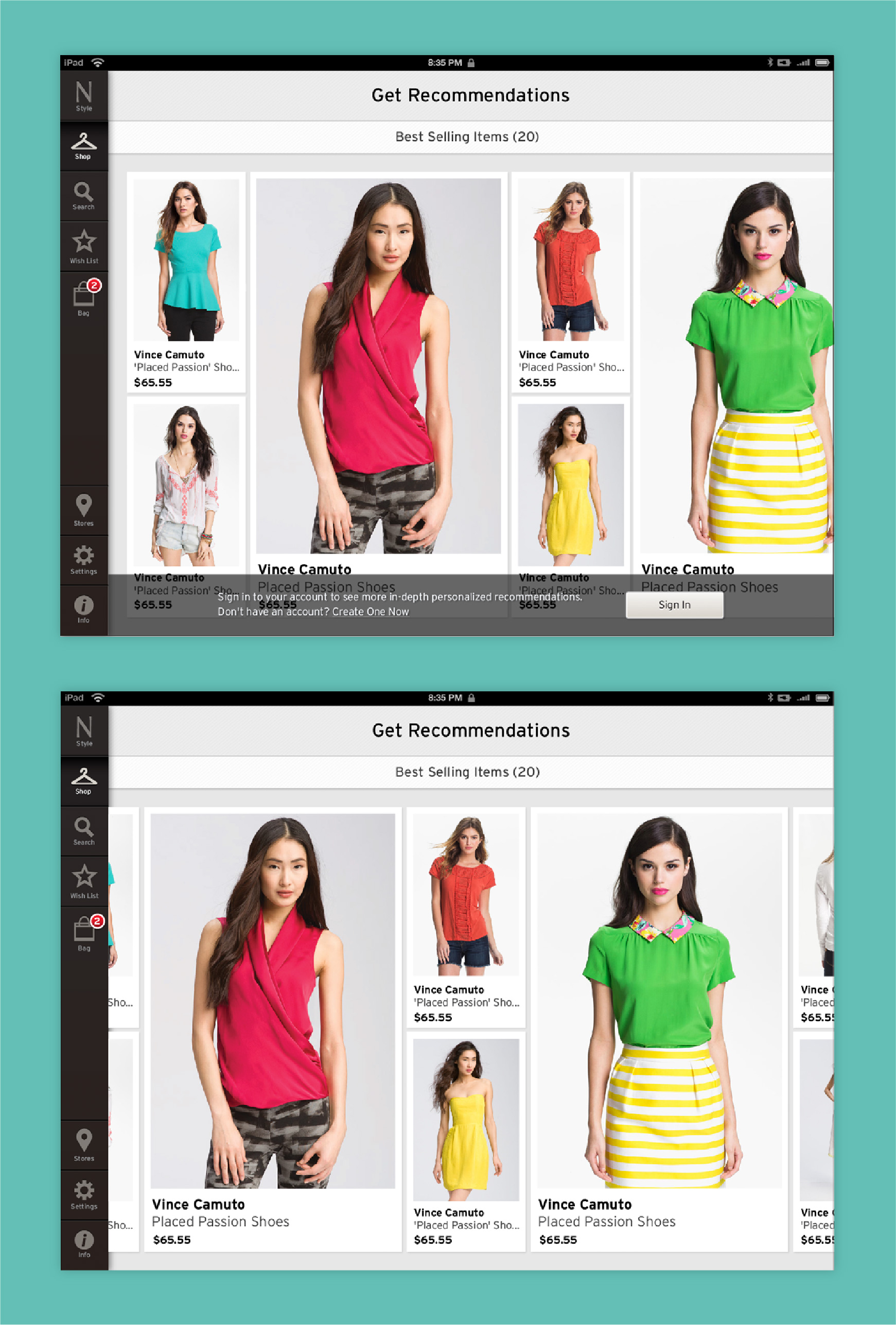
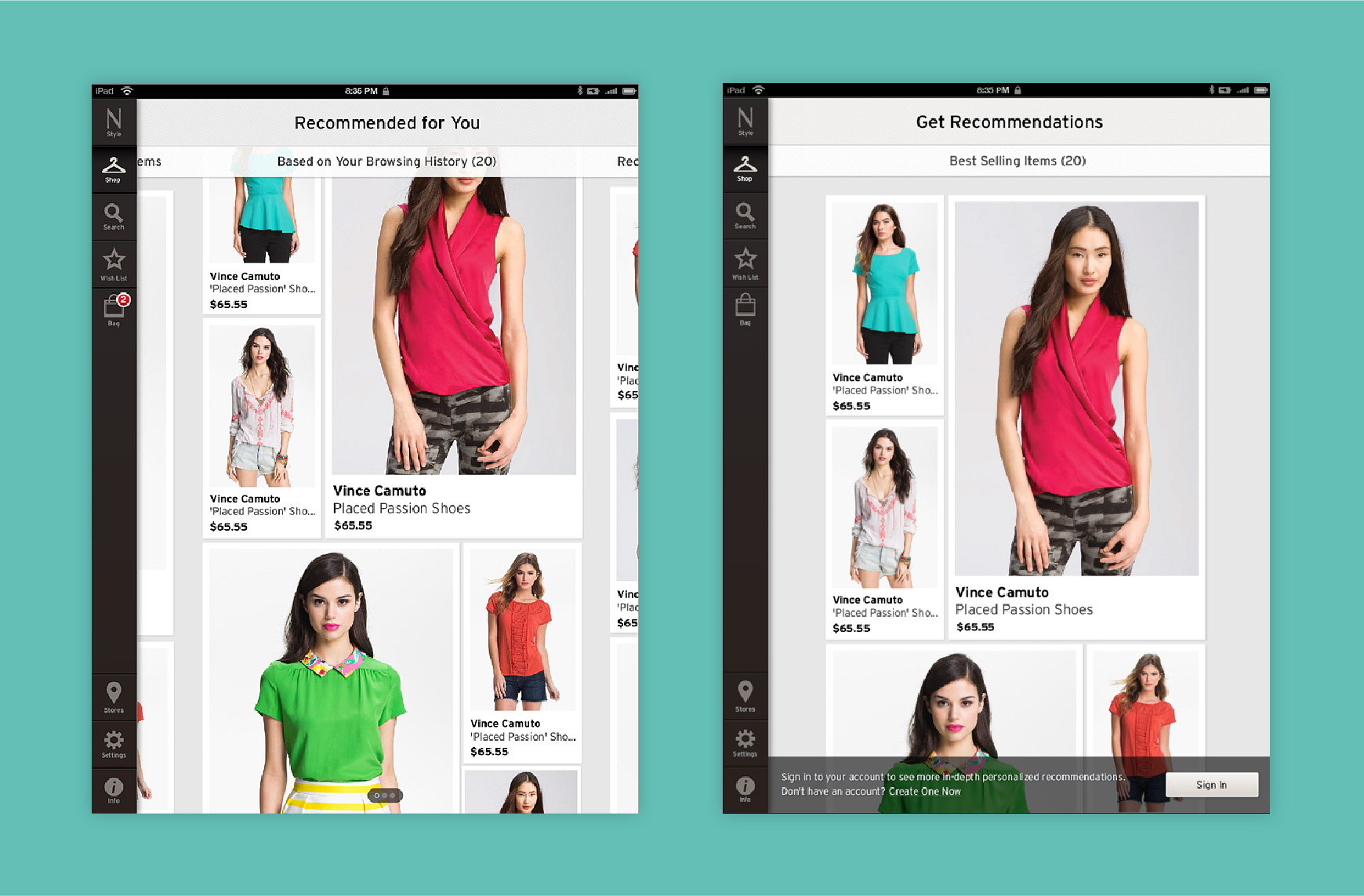
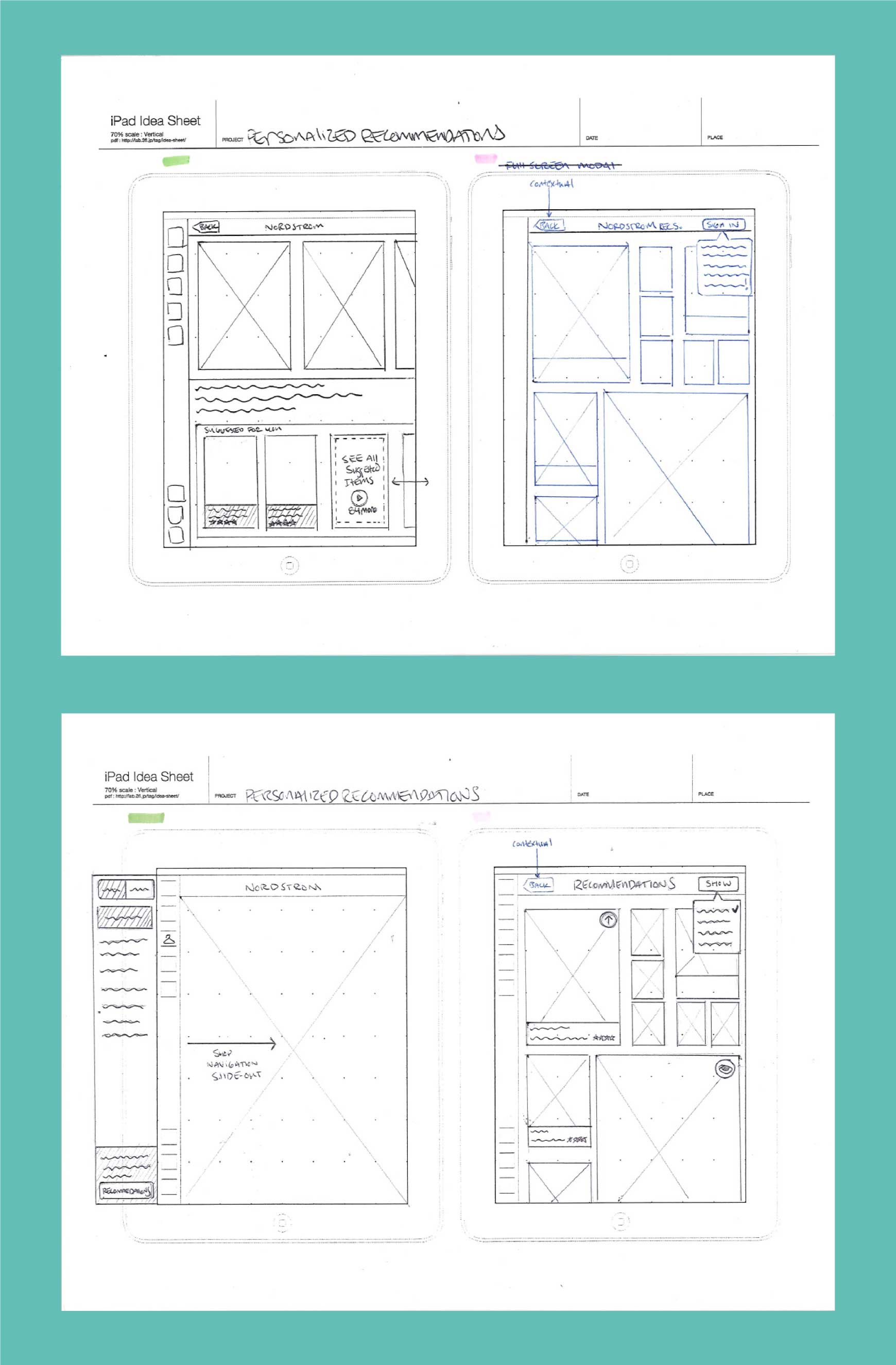
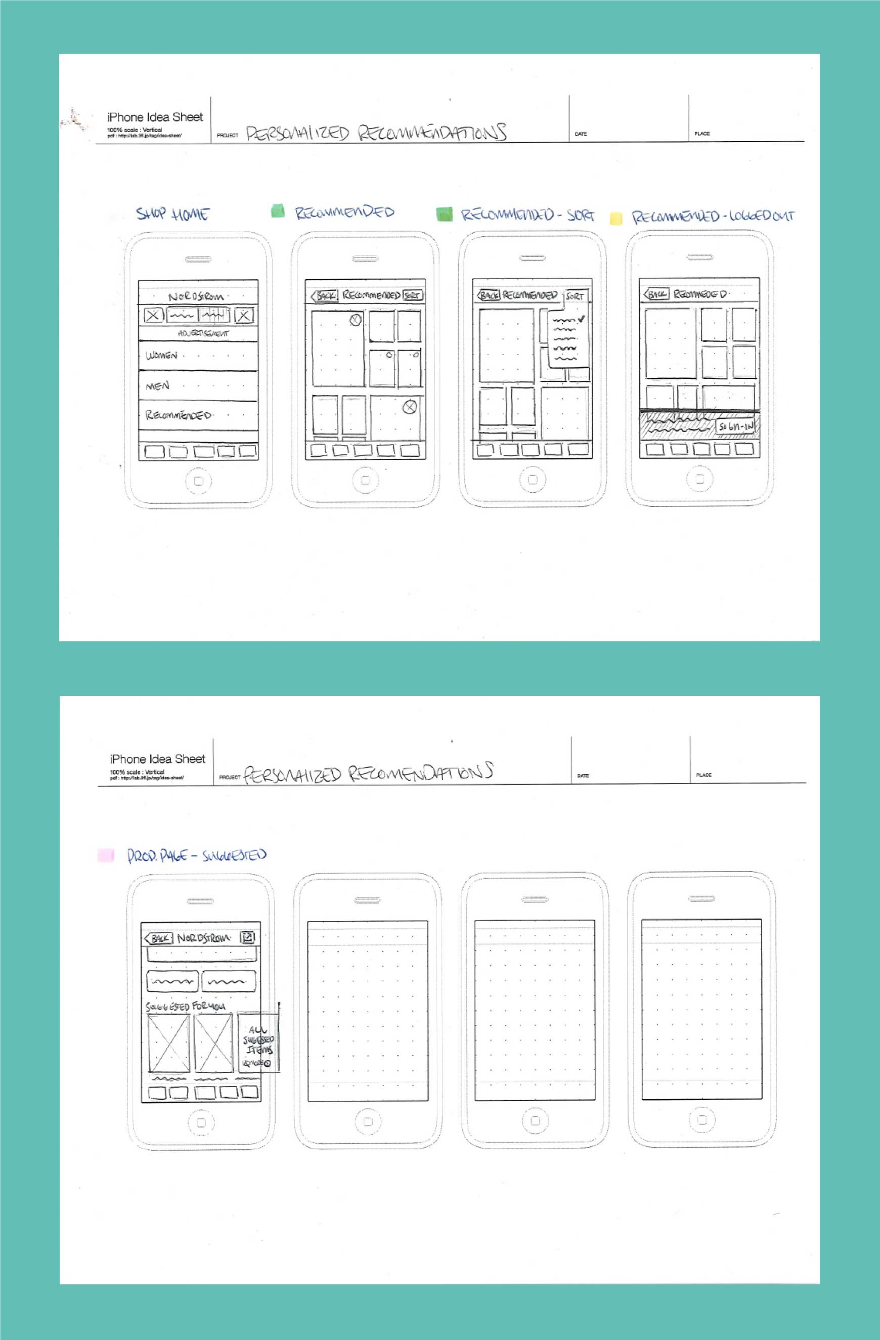
The Nordstrom Recommendations feature was intended to give users an auto curated set of recommended purchases based off of their shopping habits. Nordstrom’s core shopping experience was a traditional passive shopping experience where the user sought out their purchases through browse or search. The Nordstrom Product Group wanted to create a feature that reduced the time between starting to browse and adding an item to the shopping cart. The recommendations feature was meant to surface relevant items to the foreground for users based off of browsing and purchasing history.
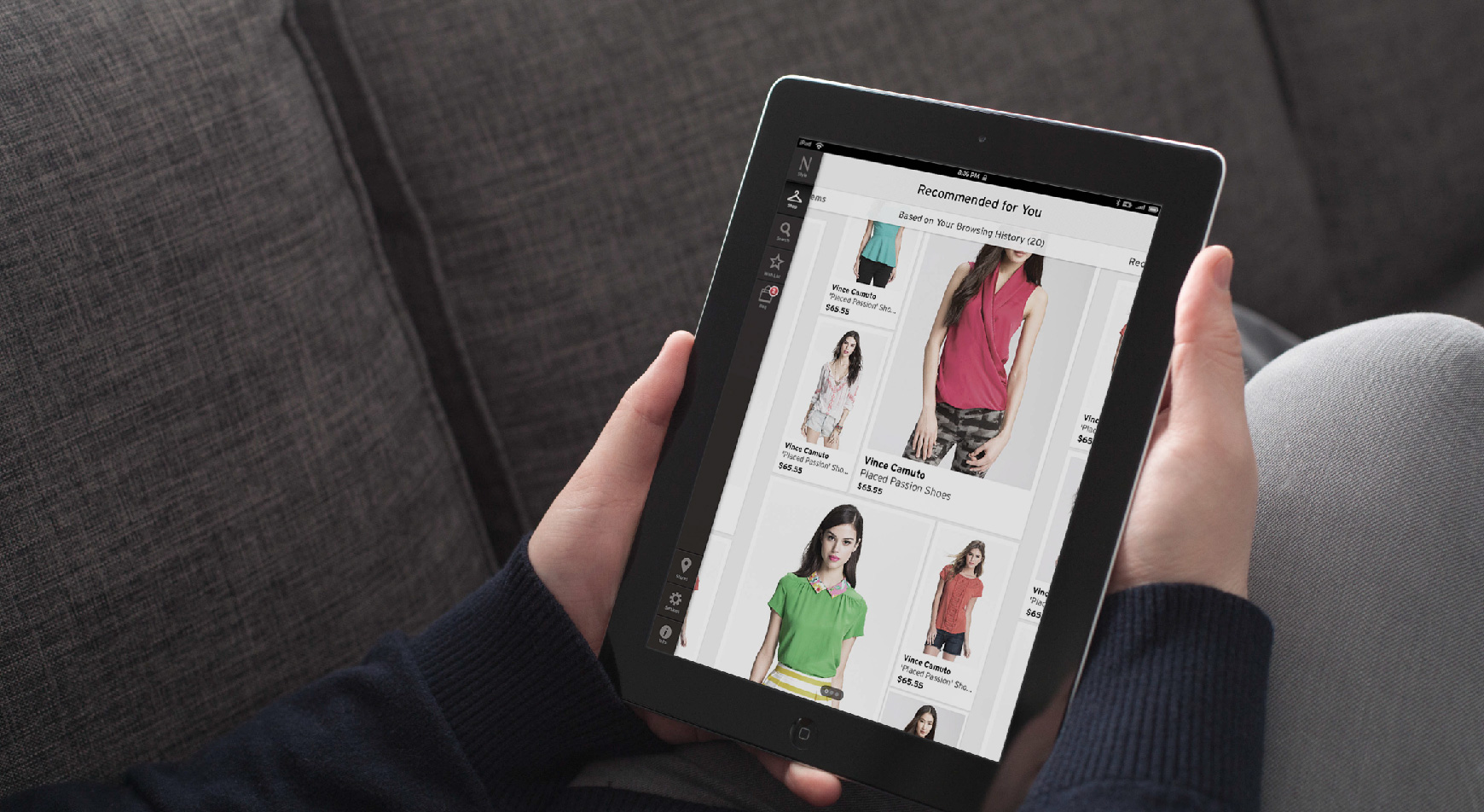
I was the lead UX designer on the project. I worked with a UX researcher and a senior UX Designer on this project. The other designer focused on the phone experience, while I focused on the tablet design. We worked closely to make sure that the information architecture and user flow of both designs were aligned. We had the opportunity to do both quantitative and qualitative research on the project and met with a variety of users that stretched across all of our mobile personas. I provided user flows, sketches, wireframes and visual designs for the iPad and worked with the Sr. UX Designer on the iPhone IA, scenarios and user flows. We worked closely with the product owners to make sure the design aligned with the vision and user feedback. We spent a fair amount of time with the development team since the recommendation engine was a new type of technology at Nordstrom.
We had the unique challenge of working with not only a new feature, but also a new back end technology. We had to work closely with our development counterparts who were building the recommendation engine technology from the ground up. We did not know the recommendation types that were going to be exposed by the API and we needed to design the feature in a way that was flexible.
Another big challenge was testing recommendations on a set of users. We had to focus more on quantitative data than qualitative feedback from individual users since the design hinged on the accuracy of the recommendations themselves. We did gather some users for usability testing of the basic navigation of the feature.
We learned that it was important to work early and often when building an experience that hinged on a new technology. We were constantly updating the scope of work for this project which forced us to build a much more flexible experience.