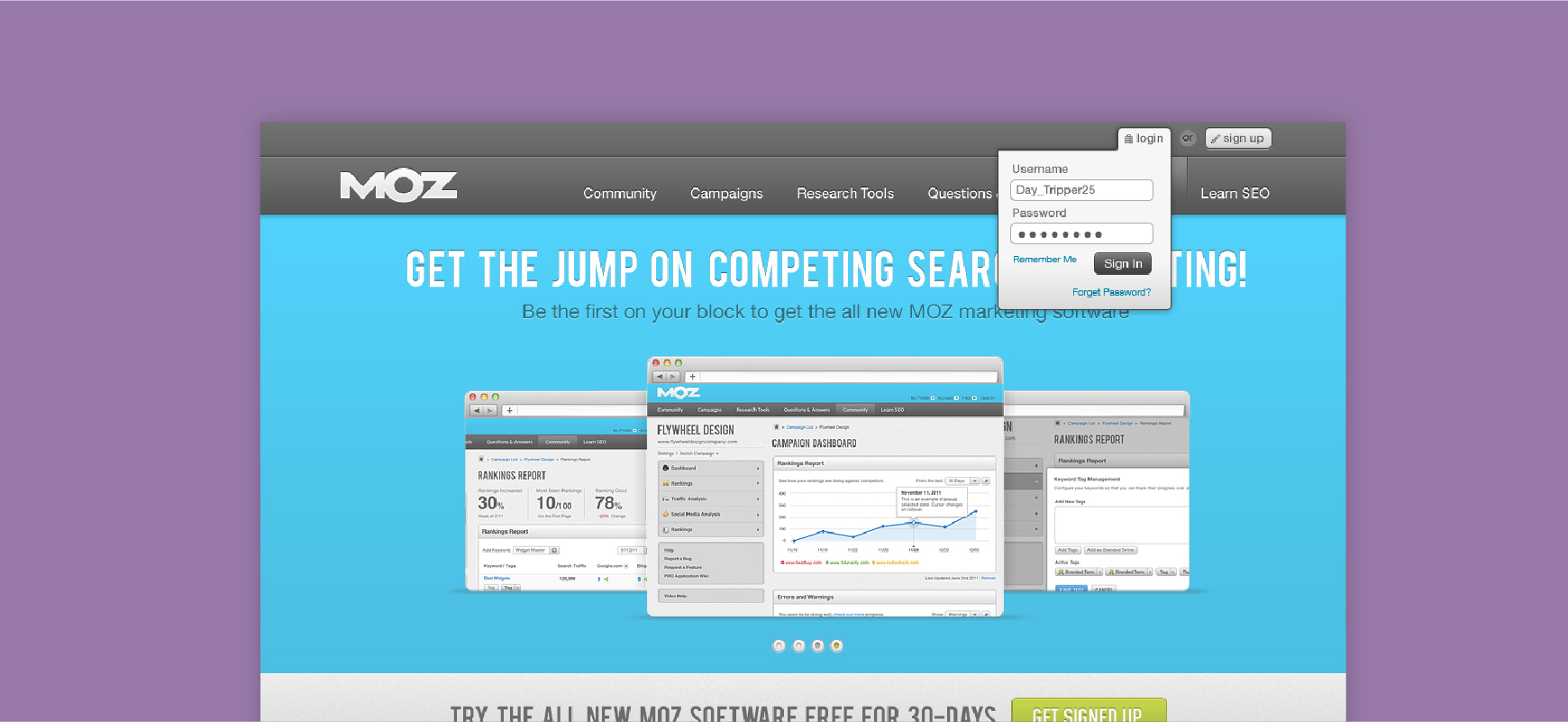
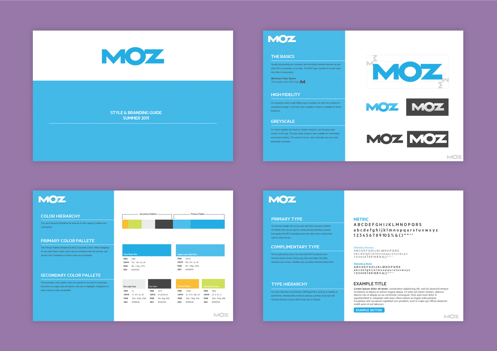
The design team has just wrapped up the new MOZ branding and we needed a fresh new face for the website to kick it off. I had also wrapped up the pattern library in combination with the new brand standards. The combination of both a new brand guide and the pattern library resulted in a fresh new look for our MOZ website. We did some initial designs to showcase the combination of the new brand and pattern library. These are those designs.
I worked both as an individual contributor and manager and collaborated with another designer on the brand redesign. While we were in full swing with the brand guide I was able to go through and audit our existing user experience patterns in the SEOmoz app. We worked to align the completion of the brand with the completion of a new pattern library so we could start combining the two. The initial designs provided guidance for the rest of the team to be able to move forward with redesigning the other secondary and tertiary pages on the site. We were able to build the majority of the site in Illustrator and Photoshop.
There were a few big challenges with this particular project. We had just completed a brand redesign and we were very excited to give the team a glimpse into what it would look like when implemented. We had the pleasure of working with the marketing team to determine which pages were high priority for showcasing the new and improved MOZ. I was also tasked to do a UX audit and go through the site to determine which patterns were most used and which ones were superfluous of those patterns. Once the audit was finished we had the challenge of building the UI to feel more Mozzy. We wanted to build a unique visual tone that fit well with the new MOZ brand.
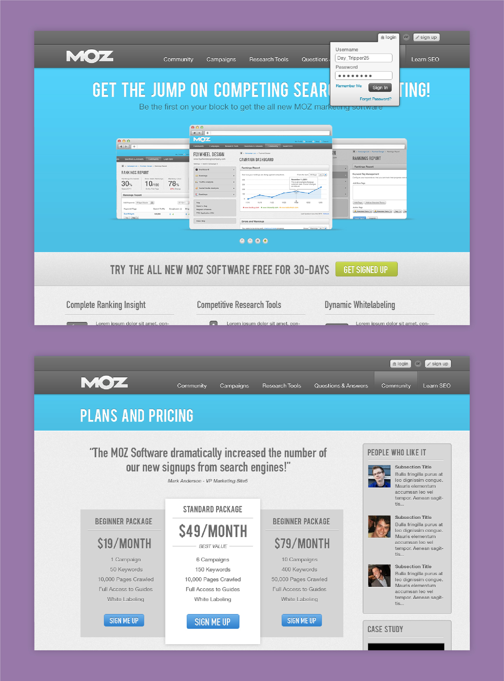
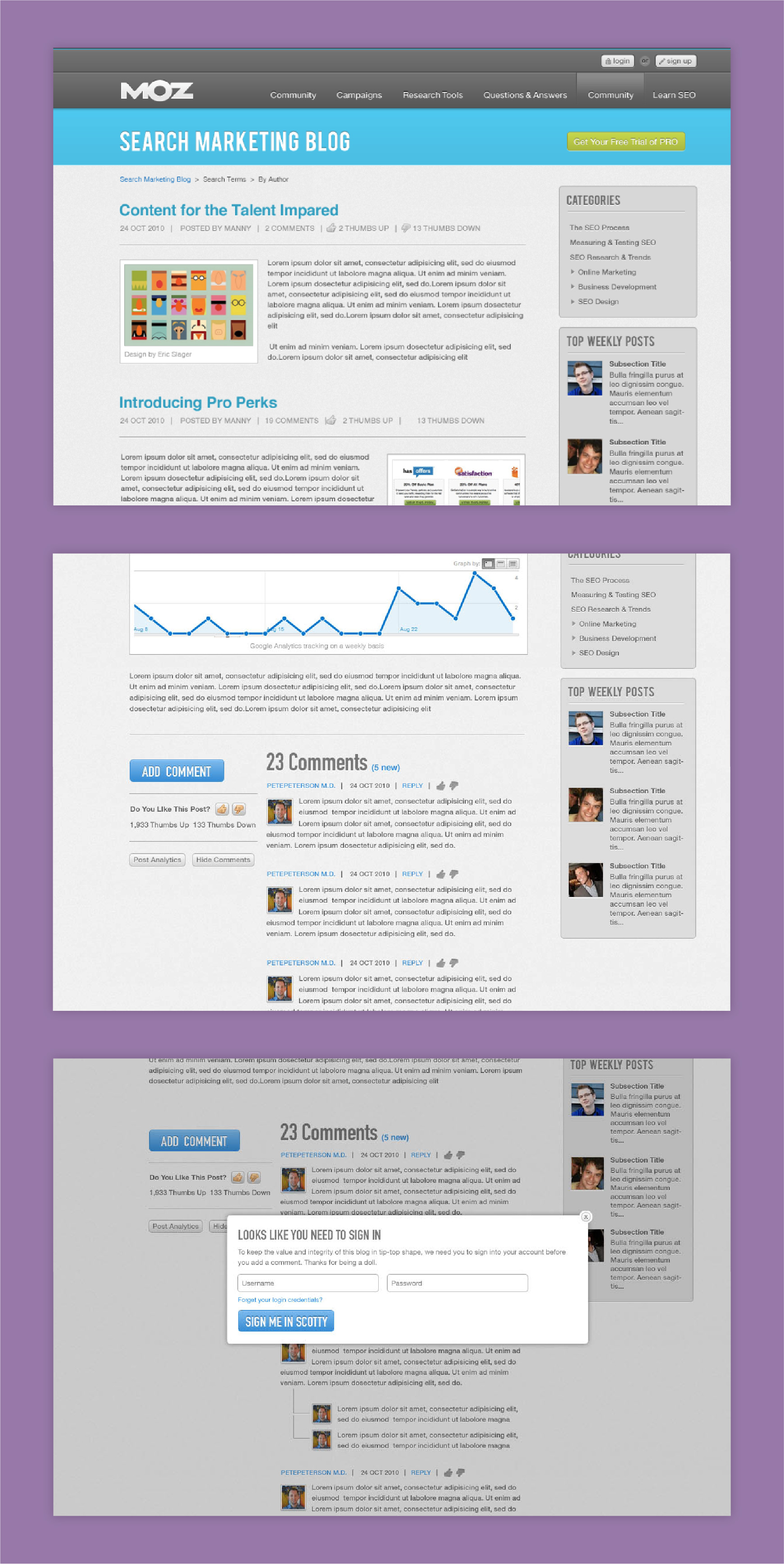
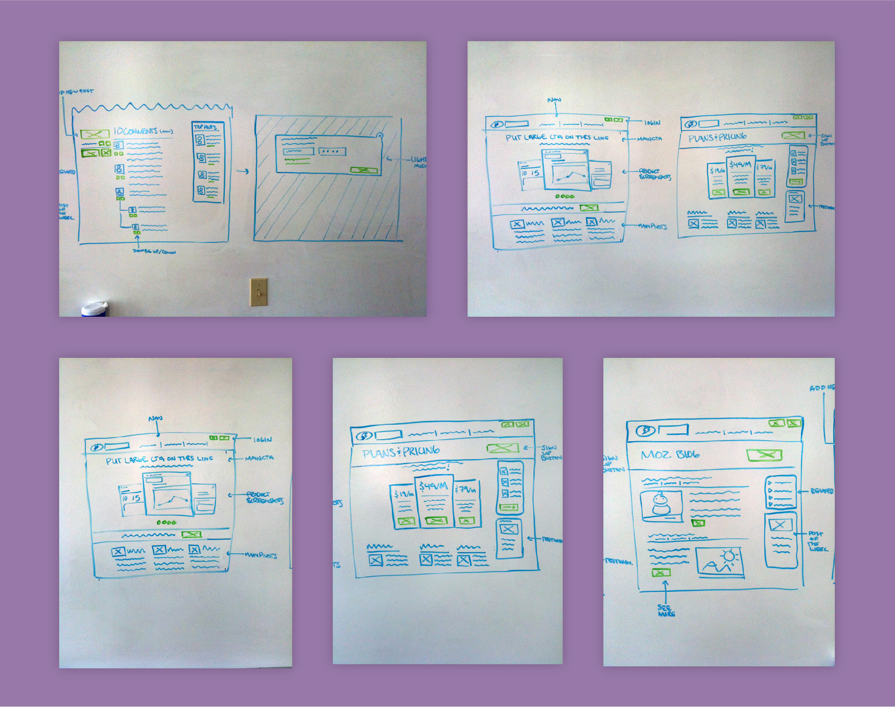
We started with building a new brand guide and also sketched out some early concepts for utilizing the new pattern library components. Early sketches included the homepage, blog, features and plans and pricing. These were three pages that had the most traffic in Google Analytics.
Building a new brand can be complicated for one. But building a new brand and doing a whole site redesign is even more complicated.
We wanted to be thoughtful of the user experience patterns at the same time that we were crafting the new brand. I was able to bring a team of three designers together and also roll up my own sleeves to accomplish this project. We took a calculated approach to a large task and came away with a fresh looking brand, a newly redesigned website and a consolidated pattern library that had the ability to move us forward. I learned that I can help guide this process from the ground up and also be a major individual contributor as well.